Michael Masterson sat down recently with Haines Wilkerson, CCO of Where® to find out more about their creative process for the VC blog.
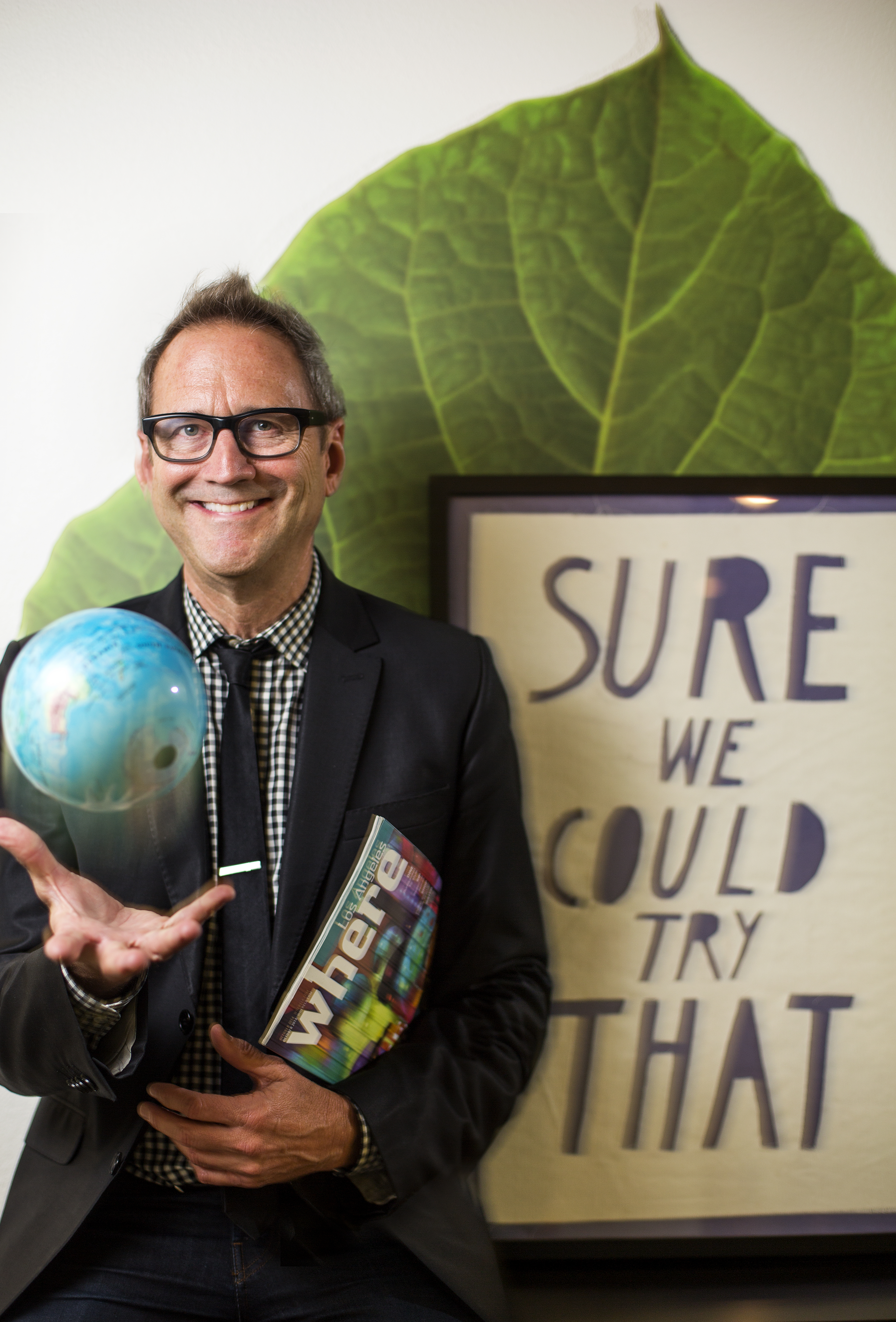
Where® is a global network of local guides, magazines and digital media focused on travel. Haines leads a worldwide network of editors, art directors and designers, overseeing content, style and brand identity. He directs the Where® Creative Studio in Los Angeles, whose projects include brand design continuity as well as award-winning custom lifestyle and travel publications, advertising campaigns, website, apps, social media and video. In the retail sector, he is currently developing Where Traveler Books+More airport stores at JFK, SFO and beyond.
1. What’s your creative process for a typical book or magazine cover?
The great thing about Where® is our unique approach to travel guide content. Unlike most guidebook publishers who send a writer to a destination for a few months and then comes out with a comprehensive capture of the place, Where® editors live in the destination. They live it and love it, 24/7. We don’t limit our focus to tourism, we hit on what makes the market special, as only someone who lives there can. Each editor focuses on the eclectic and the classic aspects of his or her town, enabling our readers to “travel like a local.”
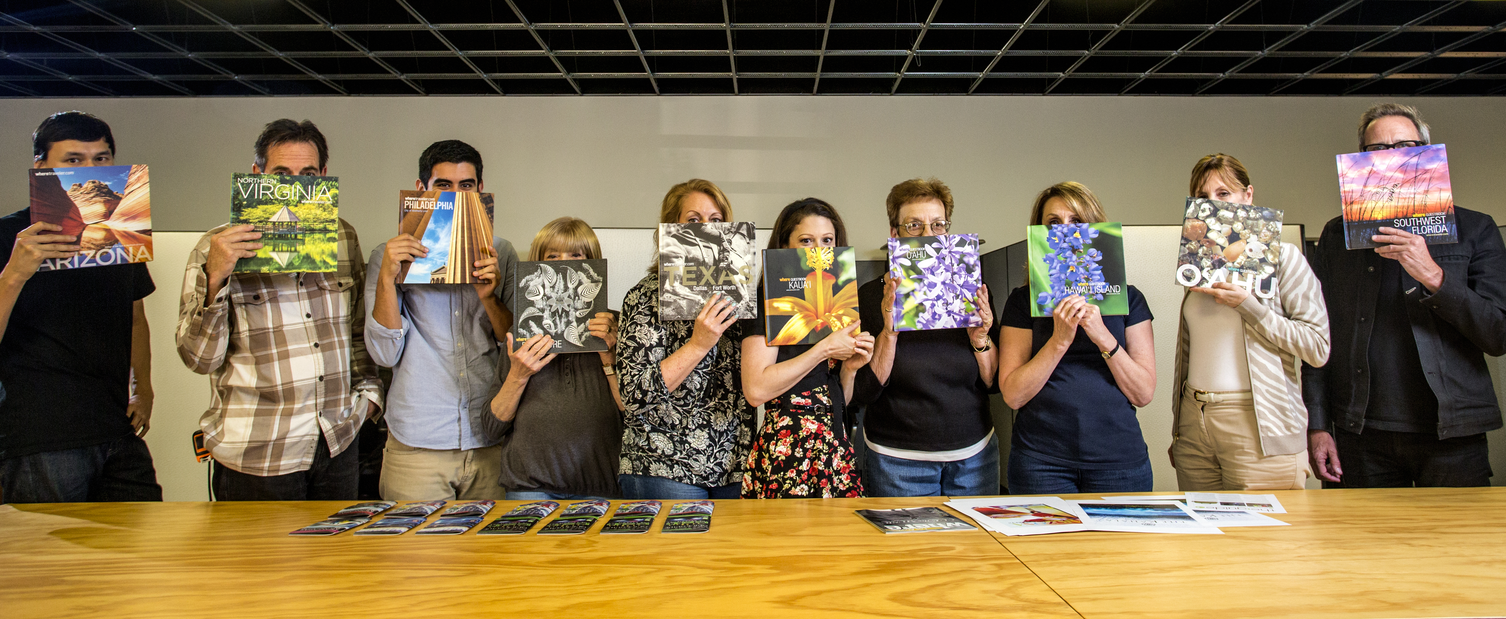
To that end, the local editor compiles an annual editorial calendar based on 12 monthly  issues and one hardbound annual GuestBook. Our design director, Jane Frey; photo editor, Isaac Arjonilla; and senior editorial director, Margaret Martin, review the content plans and suggest ways to support the stories with the strongest visuals. Some we’ll shoot, some will come supplied by galleries, museums, restaurants, attractions, etc. The balance will be stock. We, of course, utilize micro stock because we publish every month in some 40 markets worldwide, so that’s a lot of photos.
2. How has that evolved over the years?
Where® is a global network formed by the acquisition of many guidebook publishers under the umbrella of Augusta, Georgia-based Morris Media Network. The assignment for us at the Where Creative Studio in Los Angeles was to literally turn the products of former competitors into unified, complementary pieces. We went with the Where® brand name because it’s short, modern and kind of fun, like when we use the name in a title such as “Where is Taiwan.” At first one might think, “Wait, is that a question?” No, it’s a statement. “WHERE is Taiwan.” Once we unified the global brand and consolidated our voice and visuals (with the help of extensive but flexible layout formats used by each market), we were then able to get back to our ongoing quest for interesting images of city details and icons. In picturing the iconic, we always look for a twist in the lighting/cropping or a strong juxtaposition with another element. Postcard cliché images we absolutely avoid.
3. What determines whether you use stock or assignment for a particular cover?
Budget and timing primarily influence stock vs. assignment. We love the tailored, visually consistent and on-point benefits of assignment shoots. For our annual GuestBooks, we work six months out in the planning to allow the art directors time to research appropriate photographers and to coordinate the shoots. Our photo editor signs off on the designated photographers and verifies the budget. The local editor makes sure the subject matter is fully addressed. When time or budgets are tight, we turn to stock or supplied images.
4. When you use stock, what percentage is rights-managed versus royalty-free or micro stock?
According to our photo editor, Isaac Arjonilla, it varies according to the product. Typically, a  higher-end product requires RM images that have more artistic quality than do the more generic RF stock images you would find at Shutterstock or iStock. For us, it’s a near split down the middle: 45% RM stock and 55% RF/microstock. RM is utilized for covers and main features, whereas RF images are used in the more utilitarian “sights and attractions” layouts that include more photos at smaller sizes.
5. Have you ever had a cover that had unexpected consequences?
Unlike most niche-audience magazines, Where® is seen by an impossibly wide-ranging demographic, same as the traveling populace itself. Imagine trying to reach every passenger you pass in a busy airport. Young, old, liberal, conservative. We choose cover images that quickly project the theme or subject as if there were no headline to support the message. We focus on art and music, fashion and retail, recreation and sights and a ![SEAWM_130900_000c1_sm3[1]](http://www.visualconnections.com/blog/wp-content/uploads/2016/08/SEAWM_130900_000c1_sm31.jpg) lot of dining. (Travelers gotta eat and we help them find where.) But in answer to the question of unexpected consequences, we learned the hard way that if you put Elvis on the cover of an annual Memphis book, you will not have any books left in the hotel rooms beyond the first month. Not all our covers feature celebrities, but recently we featured John Varvatos on the covers of our nationwide September fashion issue when he happened to be traveling all over the world for his fashion line. Apparently, in every city he went to that month he saw himself on the cover of the local Where magazine. He was so excited he wrote personal notes to each of us at Where Creative in LA.
lot of dining. (Travelers gotta eat and we help them find where.) But in answer to the question of unexpected consequences, we learned the hard way that if you put Elvis on the cover of an annual Memphis book, you will not have any books left in the hotel rooms beyond the first month. Not all our covers feature celebrities, but recently we featured John Varvatos on the covers of our nationwide September fashion issue when he happened to be traveling all over the world for his fashion line. Apparently, in every city he went to that month he saw himself on the cover of the local Where magazine. He was so excited he wrote personal notes to each of us at Where Creative in LA.
6. Knowing you’ve done hundreds, if not thousands of these by now, what are some of your all-time favorites?
 We do a four-island set of books each year for Hawaii based on a unique theme, so as travelers island-hop, they see each related piece of the theme unfold. Those are fun and quite challenging. Naturally the best ones are shot on assignment. For those, we give the photographers up to a year to capture the theme while touching on the individuality (and beauty) of each island. We commissioned a signmaker in Nashville to construct a vintage style “N” out of galvanized metal and marquee lights for our annual GuestBook there. It was such a popular cover, we started seeing the book appear prominently in room shots on boutique Nashville hotel websites. We are very proud when our books become part of the interior design of hotel rooms while helping define the city and enhance one’s stay. Where London did a split run of all four of Warhol’s “Queen Elizabeth II” in celebration of Her Majesty the Queen’s Diamond Jubilee. They were seen all over London amid the extensive international media coverage. That was memorable, times four.
 Michael Masterson has a broad range of experience in marketing, business development, strategic planning, contact negotiations and recruiting in the photography, graphic design and publishing industries. In addition to his long experience at the Workbook and Workbookstock, Masterson owned and was creative director of his own graphic design firm for several years. Masterson has been a speaker or panelist at industry events such as Seybold, PhotoPlus Expo, Visual Connections and the Picture Archive Council of America (PACA) national conference. He is past national president of the American Society of Picture Professionals (ASPP). He currently heads Masterson Consulting, working on projects ranging from business development for creative companies and sourcing talent for them to promoting and marketing industry events as well as providing resume and professional profile services for job-seekers. He can be reached at michaeldmasterson@gmail.com.